Every Mode in the LK Forge Graphing Calculator
Most people open a graphing
calculator, type y = x², and never touch the rest. That is a shame,
because the rest is where the interesting curves live. The LK Forge graphing
calculator plots ordinary functions of x, but it also does polar curves,
3D surfaces, domain-coloured complex functions, parametric motion, shaded inequalities and your own reusable functions —
all free, all in the browser, nothing to install. This is a quick tour of what each
mode is for and the one example that makes it click.
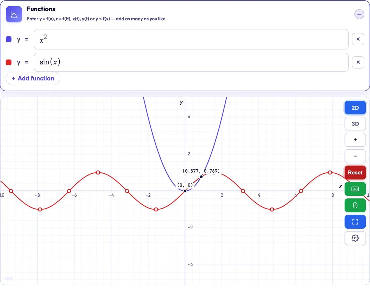
Functions of x, panned and zoomed
Type as many functions of x as you like — sin(x),
x³ − 3x, eˣ — and each gets its own colour. Drag to pan,
scroll to zoom, and a live coordinate readout follows the cursor so you
can read a value straight off the curve instead of guessing. The grid, axis labels and
angle mode (degrees or radians) all live behind a settings gear, so a trig plot can show
a π-step grid when that is what the maths wants.
x becomes a slider automatically: enter
a·x² + b·x + c and drag a, b, c to watch
the parabola stretch, tilt and shift in real time.
Open this graph → Curves in r = f(θ)
Some shapes are hopeless in x–y and effortless in polar coordinates,
where a point is a distance r at an angle θ. Switch the grid to
polar and it redraws as concentric circles and rays; enter an expression in
θ and set the θ range.
r = 1 + cos(θ) — a cardioid, the heart-shaped curve you cannot write as
a single y = f(x). Or r = cos(3θ) for a three-petal rose.
Open this graph → Two inputs, one surface: z = f(x, y)
A function of two variables is a landscape, not a line. Enter z as an
expression in x and y and the calculator renders it as a
rotatable 3D surface, so you can see the hills and saddles directly instead of inferring
them from contour lines.
z = sin(x) * cos(y) gives a rolling egg-box of alternating peaks and dips —
the classic first surface, and a good way to feel what "partial in each direction" means.
Open this graph → Colour as the second axis: f(z)
A complex function maps a plane to a plane, so there is no curve to draw — four
dimensions do not fit on a screen. Press f(z) and the calculator uses
domain colouring instead: every point z = a + bi is painted with
the hue of the argument of f(z) and the brightness of its
modulus. Zeros show as dark spots, poles as bright ones, and the colour wheel
around each tells you its order — one full cycle of hues for a simple zero, two for a
double. Faint rings mark each doubling of |f(z)|, and hovering reads out
z and f(z) as a + bi.
f(z) = (z² − 1) / (z² + 1) has zeros at ±1 and poles at
±i — two dark spots on the real axis, two bright ones on the imaginary axis,
each ringed by a full colour wheel. Then try sin(z), e^z or
1/z and watch the same colour logic explain them.
Open this graph → Motion in time: x(t), y(t)
When both coordinates depend on a third variable t, you get curves a plain
function can never draw — loops, spirals, anything that doubles back over the same
x. Give x(t) and y(t) and a range for t,
and the curve traces out as t advances.
x = cos(t), y = sin(t), with t from 0
to 2π, draws a perfect circle — impossible as one y = f(x),
trivial in parametric form.
Open this graph → Regions, not just lines
Swap = for <, >, ≤ or
≥ and the calculator shades the region that satisfies it rather than
drawing a bare curve. Strict inequalities get a dashed boundary (the
edge is not included); non-strict ones get a solid one. Enter two and their overlap shows
you the feasible set at a glance — exactly what you need for a linear-programming or
constraint sketch.
y < x² shades everything under the parabola with a dashed edge;
add y ≥ x - 1 and the overlapping band is where both hold.
Open this graph → Define once, reuse everywhere
Define your own function with f(x) = a body, and then use f
inside any other row. It keeps expressions readable and lets you change a formula in one
place instead of editing every plot that depends on it. Definitions are
order-independent — a row can use f before the line that defines it.
f(x) = x² − 2x, then plot f(x),
f(x) + 3 and -f(x) together to see a family of the same shape.
Open this graph → Roots, intercepts and extrema, marked for you
The calculator automatically finds and labels the points that usually matter — where a curve crosses zero (roots), where it meets the axes (intercepts), and its peaks and valleys (extrema) — so you do not have to hover and hunt for them. It turns "roughly where is the minimum?" into a labelled dot with coordinates.
x³ − 3x: the calculator marks its three roots, the y-intercept and both
turning points automatically — no hovering and hunting.
Open this graph → Readable curves for everyone
A high-contrast mode swaps the default palette for one that clears the WCAG AA contrast bar against the background — for every curve colour and the grid, not just the text. It follows your operating system's contrast preference automatically, and you can toggle it yourself. Colour that is only decorative on a chart is a barrier here, so the palette is chosen to stay distinguishable.
One calculator, many kinds of curve
The point of packing polar, 3D, complex, parametric and inequalities into one tool is that most real graphing questions do not stay in a single mode. You sketch a function, wonder what it looks like as a surface, need the region under it, or the curve is genuinely a path in time — and you should not have to change tools to answer that. Open the graphing calculator and try one example from each mode above; it is the fastest way to learn what it can do.
It sits alongside the rest of the LK Forge math calculators — algebra, calculus, matrices and statistics — all free and all client-side, so nothing you type leaves your browser.
Where to go next
- Graphing Calculator — open it and plot everything above.
- Derivative Calculator — the extrema a graph marks, computed exactly.
- All math calculators — the full suite, arithmetic through linear algebra.